HAHN Kunststoffe:
Corporate Design
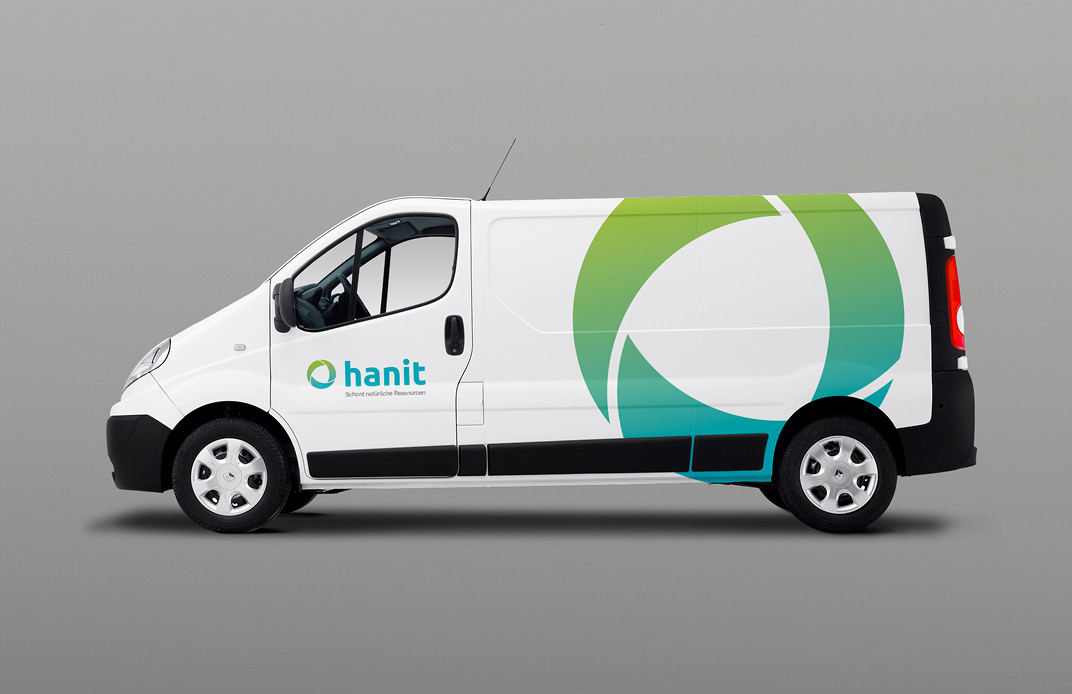
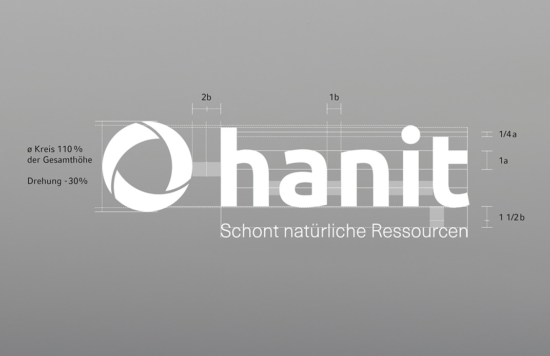
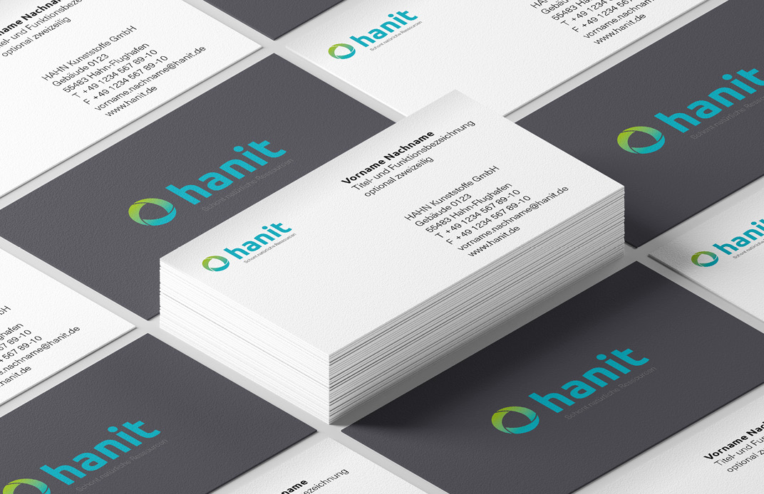
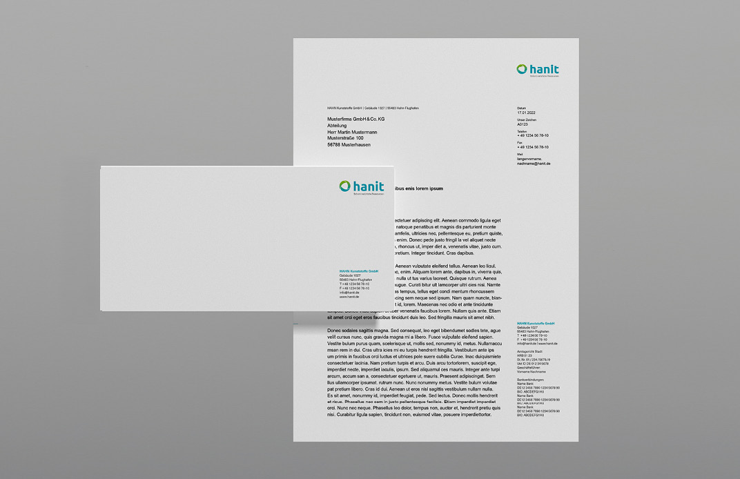
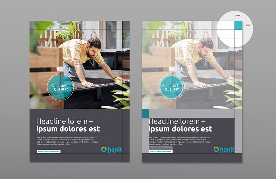
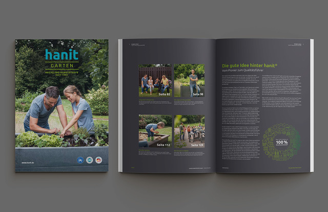
The design follows a precise grid that reinforces the geometric clarity of the logo. This results in a balanced appearance that works in both digital and analog applications.
White and dark gray form the design basis – inspired by the material hanit. These two colors are at the top of the brand identity. Turquoise serves as a guiding brand accent, while a defined color spectrum for sub-brands creates differentiated recognition.
Striking color gradients serve as attention-grabbing communication surfaces on banners, flags or social media.
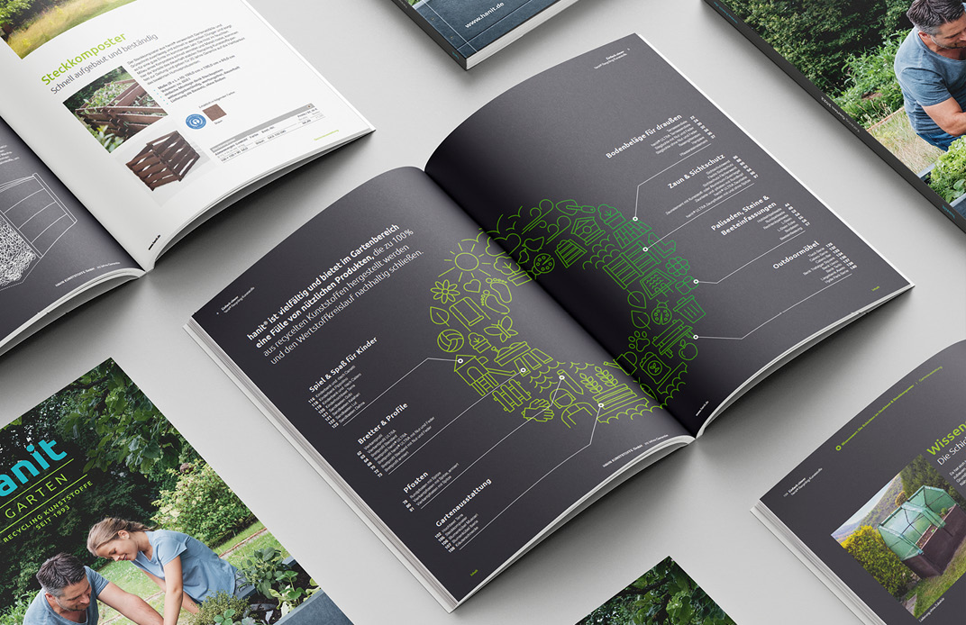
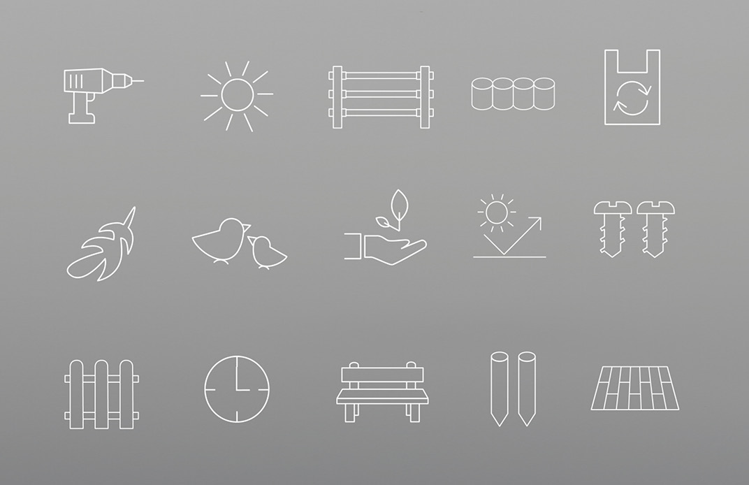
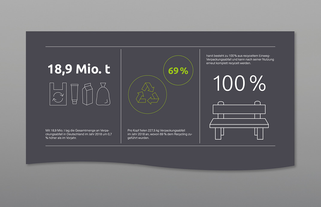
The pictograms are based on the design language of typography and translate key brand values – functionality, clarity, sustainability – into an independent, graphically reduced language.
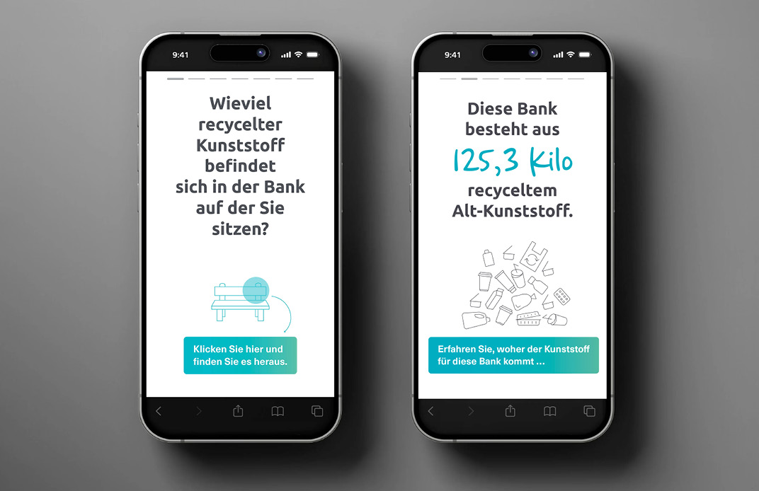
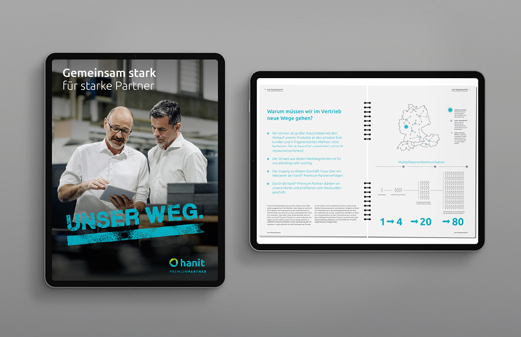
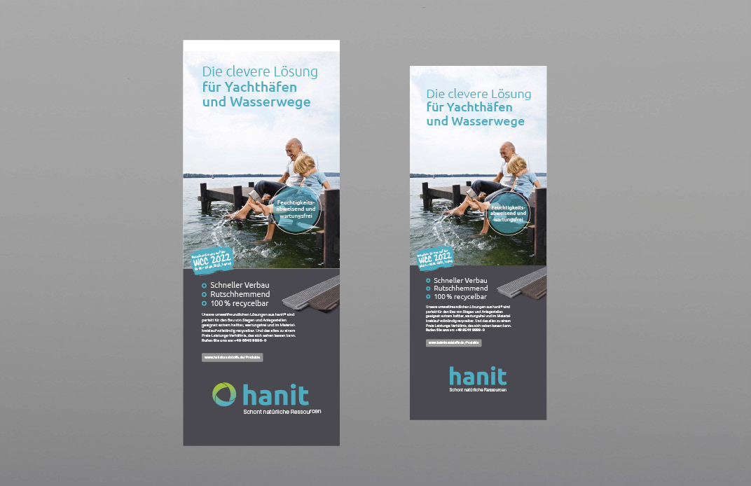
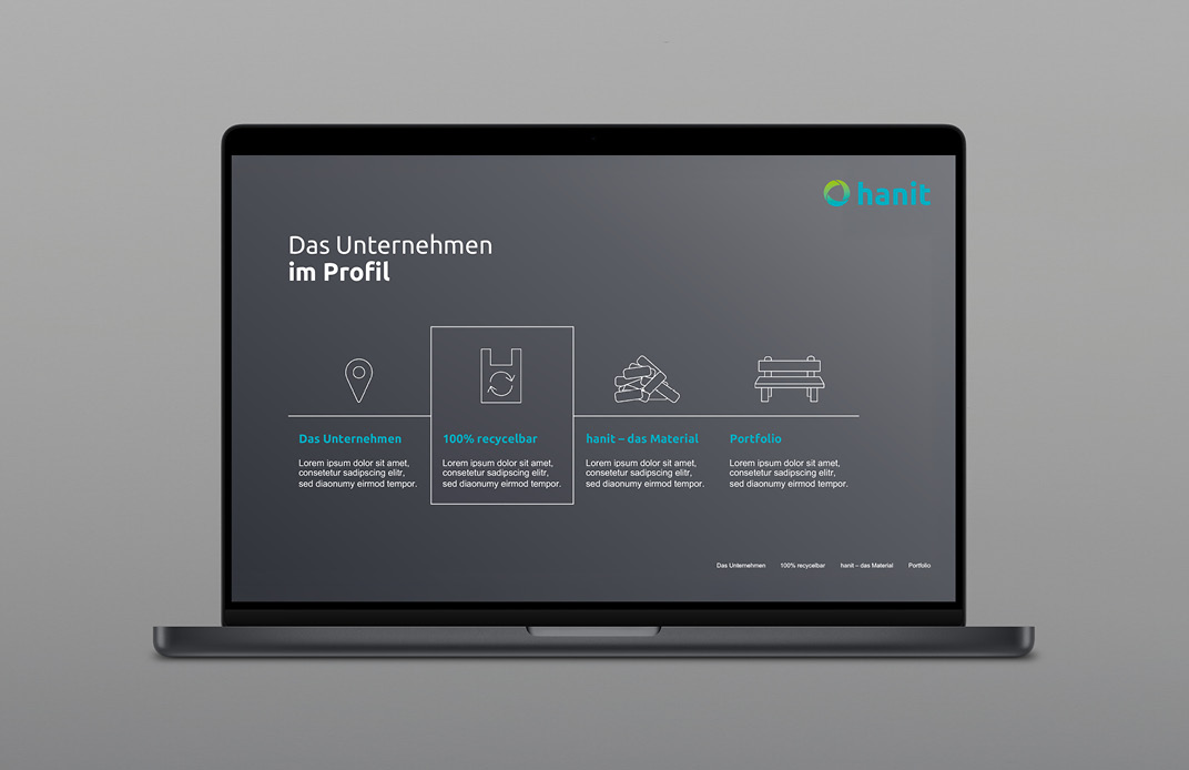
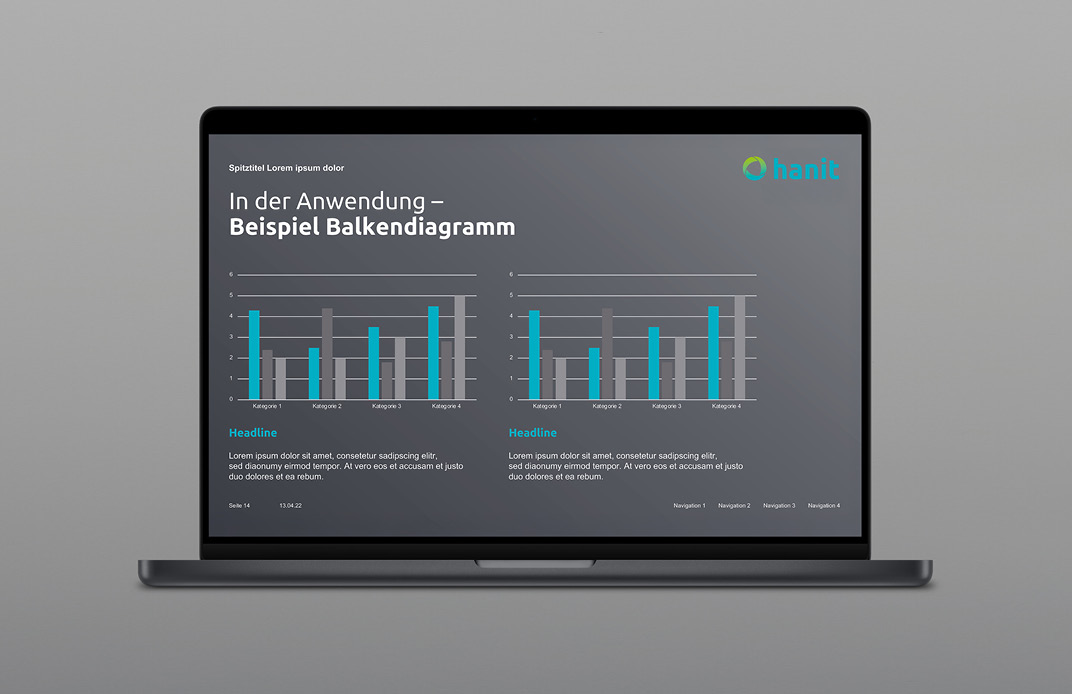
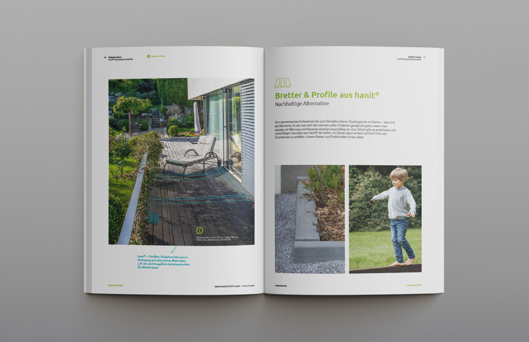
Two corporate typefaces define the brand's textual world: the organic-looking »Ubuntu« creates dynamism, while the »Neue Haas Unica Pro« lends structure and a technical profile. The typographic system is complemented by a personal-looking handwriting style, which, in combination with arrows and transparent marker circles, provides practical guidance.
Visual language

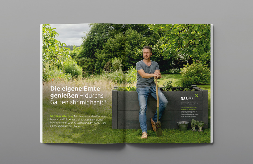
hanit's visual language relies on a clear, authentic aesthetic that connects the brand's technical expertise with an emotionally accessible approach. Natural materials, genuine moments, and tangible applications create a sense of visual connection – the material is not just shown, but experienced. The photography follows a documentary aesthetic: minimally staged, with a focus on real-life usage scenarios.


 Top
Top